 An initiative from Chris Andrews Web Services
Out of frustration with many websites online today whose text is virtually unreadable, sometimes it's too small,
and often it's virtually the same colour as the background, I have determined to make every site I design accessible to read for
everyone. This might seem an obvious thing to do, but achieving this level of access is not always easy or straightforward. But
in my view, it's a worthwhile goal.
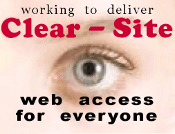
I have chosen the title 'Clear - Site: web access for everyone', as this describes the purpose of my endeavour.
To achieve this outcome I have developed my 4 point accessibility check:
• text readers - (used by visually impaired people) must have access to all pages and all links on the site. In
addition, fully descriptive text must be included with every 'graphic'.
• clear text - must be used which is not too small and must be readable against its background.
• big text (sometimes called 'Large Text') - is a link I provide to assist people with poor eyesight. The
function of this link depends on the format of the 'host' website. It may take you to an alternate version of the site with larger
text, such as 'printer friendly' pages, or it will take you to a page where I show you how you may use the controls on your browser
to enable you to enlarge the text on your monitor. more info >>
• relevance - The website design and content must be relevant and appropriate for its purpose.
When a site passes these tests I place the 'Clear - Site' logo on its Home Page.
© Copyright 2007 Chris Andrews Web Services
|